Project 1: What Are Your Tools?
“When you enter an environment where there are birds, insects or animals, they are listening to you completely. You are received. Your presence may be the difference between life and death for the creatures of the environment. Listening is survival!”
– Pauline Oliveros
As new graphic designers, you have entered a relatively young discourse. Unlike architecture or art, our field is still articulating its principal concerns and the character of its critical landscape. For this reason, you have the opportunity to meaningfully contribute to a community and discipline, but first you must recognize what exactly you value within the profession. What will be your manifesto?
In this project, I want you to think like a corvid, a class of birds (including jays and crows) that are distinctly clever at nesting and tool use. Over the course of this project, you will develop a manifesto, a “nest” of sorts, that projects a personal stance on design for an audience of peer designers. You have full control over the content, its structure, and the final message. This nest will offer a foundation for the next project as well.
In addition to developing a manifesto for your design practice, I’m going to ask you to use a tool that either you found or made to draw a typeface articulating your “making practice.” I’d argue that type is one of the few areas fully owned by graphic designer, so it makes sense for us to start our critical practice here: with letterforms. You will showcase these typefaces with a series of posters that highlight three words/phrases from your manifesto.
Grading
Your grade for this project will make up 1/4 of your grade for the class. You will be evaluated based on your capacity to curate and present a set of thoughtfully designed visual studies grounded in a single subject, a well-articulated and meaningful statement, and a composition that showcases meticulous attention and professionalism in achieving the objective.
- Type & Language
- You will develop a "Nest." This tool will be useful for both your Typeface and your manifesto. You will utilize the template provided.
- In a 8.5" x 11" page, please write your first considered draft of your manifesto. Word choice, structure, cadence and pacing should all be carefully edited to reflect an identified tone of voice. You will utilize the template provided. The text should be set in SF Pro and include the following:
- at least 300 words articulating a personal position regarding graphic design
- at least 2 quotes (either directly quoted or paraphrased) supporting your position
- a description of your aesthetic that could be eventually illustrated in a spread
- Tools & Typeface
- You will select or create three tools. Your tools can be writing utensils, stencils, etc. — anything you can make letterforms with
- Having selected your tools, I'd like you to experiment with designing an H O A with each. This will determine the viability of your tool.
- Elaborating on your strongest H O A, you will build a full typeface, including punctuation. It is not required to develop a lowercase, but you are free to do so if you'd like.
- Production
- You will develop a set of three posters that includes three key words from your manifesto set in your new typeface.
- Your final poster should be:
- A1 Size (594 x 841 mm)
- In a single color
- Printed on a thicker stock of paper.
Resources
Readings
- Ursula K. LeGuin's "The Carrier Bag of Fiction"
- Elizabeth Goodspeed's "Becoming the Zeitgest"
- David Reinfurt's T-Y-P-O-G-R-A-P-H-Y
- Ben Denzer's Parsons Lecture
- Sarah Gephart's "Fonts as Money"
- Ramia Mazé's "Critical of What?"
- Susan Sontag's "Posters: Advertisement, Art, Political Artifact, Commodity"
- Margaret Andersen's "Why Can’t the U.S. Decolonize Its Design Education?"
Inspiration
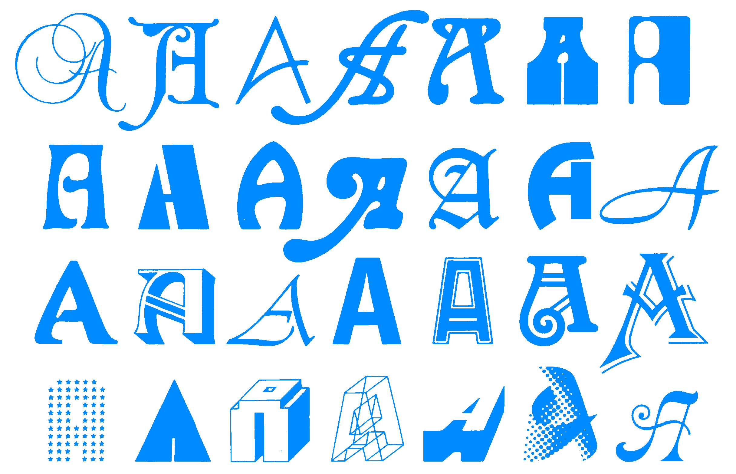
- Typefaces
- Tools
- Brand Manifesto Examples
- 50+ Great Brand Manifesto Examples
- Download the manifesto examples found on this site.
- Link
Writing Structure
- The Z-Shape Manifesto
- Perfect for making one point really well. Use this structure when you have a strong point of view and a lot of examples to back it up.
- Link
- The S-Shape Manifesto
- The most common manifesto for establishing new ideas and big brand campaigns. Not great for setting a mood or celebrating something.
- Link
- The U-Shape Manifesto
- My go-to structure for creating emotion. Great for pulling folks the depth of your problem, then lifting them up higher on the other side.
- Link
- The J-Shape Manifesto
- A rare shape, but surprisingly effective at creating a mood. Can be used for new ideas, but requires a lot of craft to get right.
- Link
- The E-Shape Manifesto
- Ideal for celebrating or creating a tribute to something. Make sure to focus on breadth. Go wide and far. Don’t tell a story.
- Link